Politics & Government
Crown Valley Park Master Plan Survey Coming to a Computer Near You
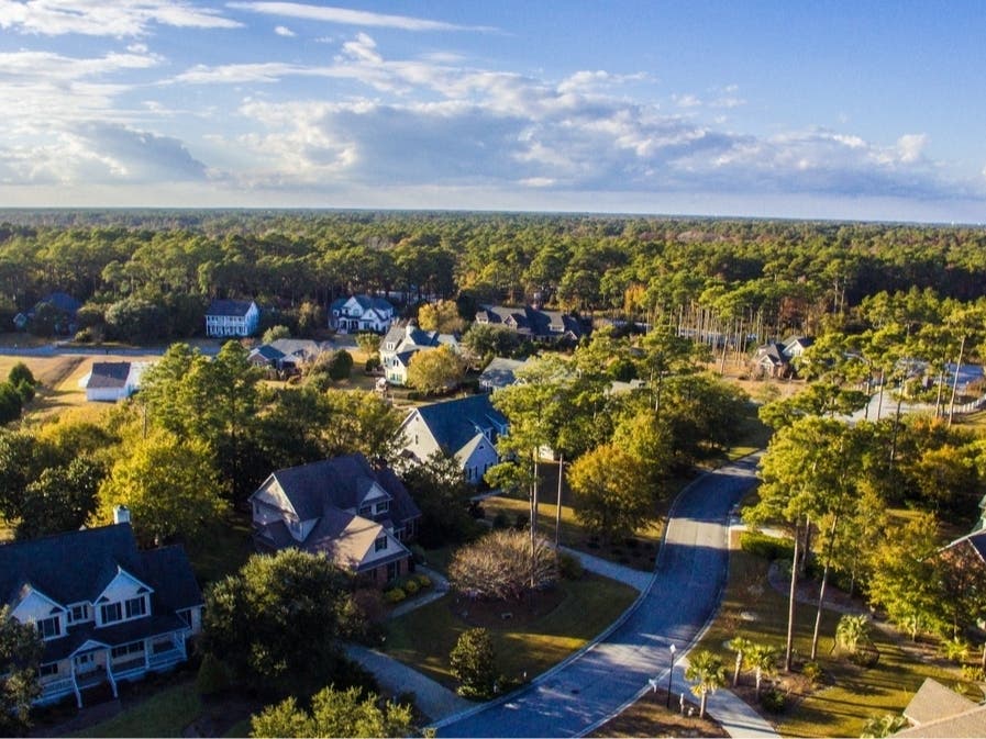
The city's leaders want to know your thoughts about what to do with the park located off Crown Valley Parkway near the YMCA.


Before you hit the junk mail folder in your email program, be sure to read a message from the city of Laguna Niguel.
It is from city leaders who are currently developing a master plan for located at 29751 Crown Valley Pkwy. They want to learn how you presently recreate at CVCP; what you like about the park; and what you would like to see improved in the future. The cost of the master plan for the park is already part of the city’s budget.
The park, including the swimming pool and its main building, was constructed in the late 1970s; the modular office buildings were moved onto the park in the 1990s. The YMCA has a larger, permanent building in the park that it leases from the city long-term.
Find out what's happening in Laguna Niguel-Dana Pointwith free, real-time updates from Patch.
This survey will be open through Dec. 16 at 5 p.m. A separate survey for youth ages 11-18 is being conducted concurrently. Preliminary results will be shared with the public at a Community Workshop on Dec. 12 at 6:30 p.m. in the Crown Valley Park View Room.
Now is the time to let your voice be heard and join in on the planning process.