Business & Tech
Wendy's Burger Chain Revamps Iconic Logo
A new red-haired girl with pigtails, inspired by the founder's daughter, will be introduced in March to restaurants including the Laguna Niguel location. Do you think she looks different?
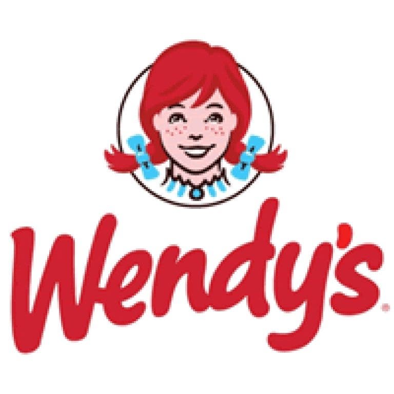
Another company has decided to rework its image, as well as its brand logo, this time it’s Wendy’s.
Last week, the burger chain founded by the late Dave Thomas unveiled its new, more contemporary brand logo that will start popping up in March 2013. This means the chain's restaurants, including the , that has been in The Grove shopping center for well over two decades, will feature the new logo, as well as some other updates. However, it could be some time and may not happen overnight, the company spokesman, Denny Lynch told me.
"All of the new stores being built will have the new logo and new interior and exterior beginning in 2013," he said. "Eventually, yes, the Laguna Niguel store will also have the changes."
Interested in local real estate?Subscribe to Patch's new newsletter to be the first to know about open houses, new listings and more.
The changes? It all starts with the company’s female mascot, the little red-haired girl inspired by Thomas’ then 8-year-old daughter in 1969. She has been streamlined to look younger, hipper. The chain reports it is also working on updating its menu, and physical appearances to its restaurants around the country.
But back to the red-haired girl, is she better? More modern?
Interested in local real estate?Subscribe to Patch's new newsletter to be the first to know about open houses, new listings and more.
I looked and then I looked again to see what the difference is, and for the life of me, all I saw was that font had changed on the Wendy’s name. It seems to be more stretched, and less Colonial looking.
Then, I put on my glasses and looked a little closer. She still looks like Pippi Longstocking to me.
On further inspection, I noticed she looks a bit softer, maybe younger, but I still see an image reminiscent of a girl who should be starring in a Western movie.
According to the company, this is the first change to Wendy's logo in almost 30 years, as the hamburger chain says it wants to rebrand itself as a higher-quality fast-food chain.
"We want the most prominent symbol of our brand to reflect the transformation that's currently under way," Chief Marketing Officer Craig Bahner said in a statement.
The new logo signals innovation while staying true to the brand's legacy, he added.
The new logo is also devoid of such phrases that we’ve grown to love: "Quality is our Recipe" and "Old Fashioned Hamburgers."
A few months ago, Quaker Oats revamped its company's logo, the Quaker Oats gent. It gave him fewer chins, and cut his hair; I couldn’t see much of a difference there either.
Wendy’s sells billions of burgers, (and Frostys) and people identify with the little girl and her pigtails.
Why fix it if it ain’t broke?
Will you buy more burgers at Wendy’s because the little red-haired girl looks different?
Hey, if they really wanted a makeover, perhaps they should have called lead celebrity stylist, Rachel Zoe.
What do you think? Does the Wendy's logo look any different? Better? Worse? Tell us in comments.